We know how important landing page optimization is — when customers click on a link or an ad, they’re expecting to be redirected to a page advertising exactly what they saw or read about in the ad. It’s a pretty simple expectation to fulfill, but it’s also important to get your customer to look beyond what is being offered in the ad — to further explore your site and your products. Not only is this important for normal display ads, it’s also important for Facebook ads. The folks at ModCloth have solved this problem in a simple and easy-to-navigate way. We took a closer look at two ModCloth Facebook ads in particular to show how they are doing it.
Tactic #1
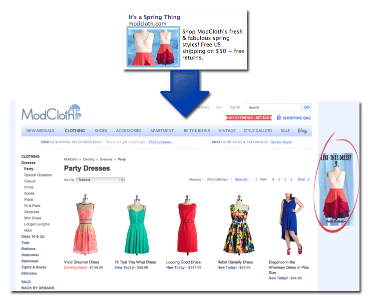
The first ad highlights a spring party dress. Although clicking on the ad doesn’t redirect users to the product page for that specific dress, it highlights all of ModCloth’s party dress selection and then spotlights the specific dress displayed in the ad itself with the copy “Like this dress? Find it here” and a link directly to its product page.
There are two reasons why this is a smart design. First, it highlights the dress displayed in the ad. The reason I clicked on the ad in the first place was because I wanted to see the details on that specific dress. By giving me a shortcut to get to that product page, the ModCloth team is saving me time and patience. Second, it showcases similar products. The party dress page shows a variety of products, so users who are intrigued by the ad, but not the dress itself, can browse the selection without having to navigate away from the landing page.
Tactic #2
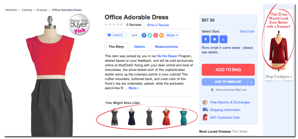
The second ad highlights a work appropriate dress, and clicking on the ad redirects the user to that the product page for that dress.
The page also boasts a couple of excellent features. First, it features similar products, so that unsatisfied customers have a better chance of finding a dress they like. This saves users the frustration of attempting to navigate the site and find similar looks by sifting through the dozens and dozens of dresses the site has in stock. Second, it encourages users to increase their purchase by highlighting a complementary article of clothing, and specifically calling it out in the link copy (“That Dress Would Look Even Better with a Sweater!”). Not only does this help the site increase the chances of a larger sale, it also serves a purpose for the customer — giving them an idea of how to complete their look while still keeping within the “work appropriate” theme.
Make sure your own Facebook ads are the best that they can be with our Facebook ads guide. Still don’t believe you need a unique landing page for your ad? Join us as we debunk the myth of the one-size-fits-all landing page.


