No brand wants to see an email subscriber go, but it’s important that the process is made as simple as possible. Why? Because more and more email services are taking the task of unsubscribing out of the recipient’s hands.
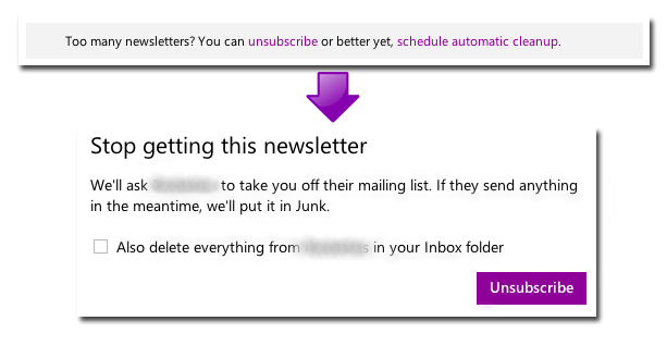
Microsoft’s Outlook, formerly known as Hotmail, automatically identifies relevant messages in a user’s mailbox as newsletters and tags theme with an invitation for the user to unsubscribe from the sender. Convenient for users? Absolutely. Bad news for brands? It can be.
Not only does the service unsubscribe the user without giving them the options that the sender brand would (e.g. an option for fewer emails, an option for emails about a certain product), it also goes an extra step. Once a recipient has unsubscribed, Outlook automatically places any further emails it receives from that sender in the recipient’s junk folder — decreasing the chances it will be seen and increasing the chances it will simply be considered spam.

Rather than give the power to email services to classify messaging as Junk or Spam when it actually isn’t, make sure that your email blasts state very clearly how recipients can easily unsubscribe. Here’s how:
Display the unsubscribe link/instructions prominently

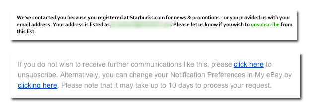
Although all unsubscribe instructions/links are generally found in the bottom text of an email blast, there are a few ways you can help it stand out to make it easy for recipients to spot. Setting the link off in a different color, like the example from Starbucks, is a good way to make sure it’s seen. Another way it to set off the link by using link text that reads something like “click here.” The easier it is to spot, the happier your recipients will be.
Offer choices for managing subscriptions

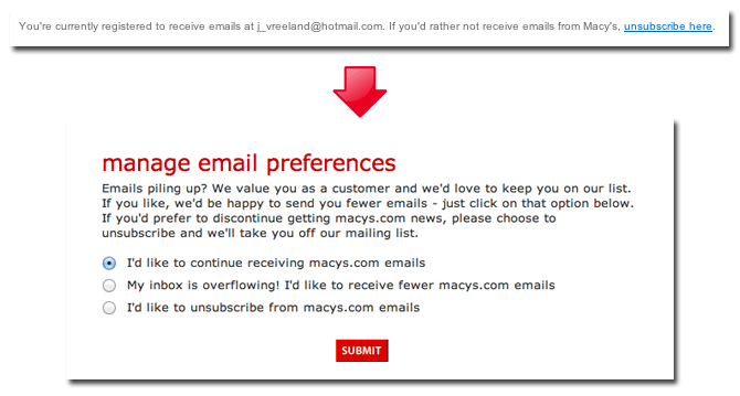
It’s possible that your recipients don’t want to completely unsubscribe from your messages. Anticipate their needs and offer a few subscription options, including reduced emails and the option to receive a weekly or even monthly digest. These account preferences can be linked to your unsubscribe messaging or they can be linked to messaging that simply invites them to update their account preferences.
Send/display confirmation text reflecting changes

Once a user has changed their preferences, set it up so that they receive confirmation, either by a web page or an email, that assures them their preferences were changed. This is a good place to include a disclaimer if their changes won’t take effect for a few days. This will let them know exactly what to expect, and help you prevent frustrated subscribers from marking those few following messages as spam.
Need more email marketing tips? Make sure you’re up to date with email best practices with our six essential updates.