
PolicyGenius is trying to reinvent the way young adults research and sign up for insurance. It’s a great concept for a service, but it’s not necessarily appealing to the average user. How do you make it more appealing? Create an excellent landing page. What makes it so great? Check out our breakdown.
Personalized signup form
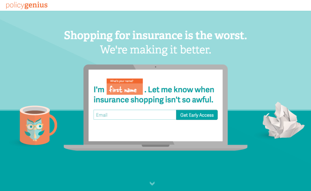
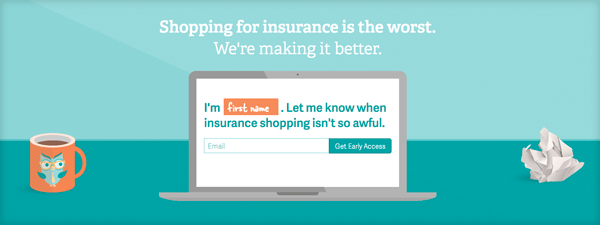
Rather than having a standard, boring form, the PolicyGenius signup form is more personalized and attractive. It asks users for email addresses and their names in a fun, creative way that appeals to the exact reason that users are interested in the service in the first place — shopping for insurance is awful, but we have a solution coming soon.
Responsive design that keeps the signup form visible at all times
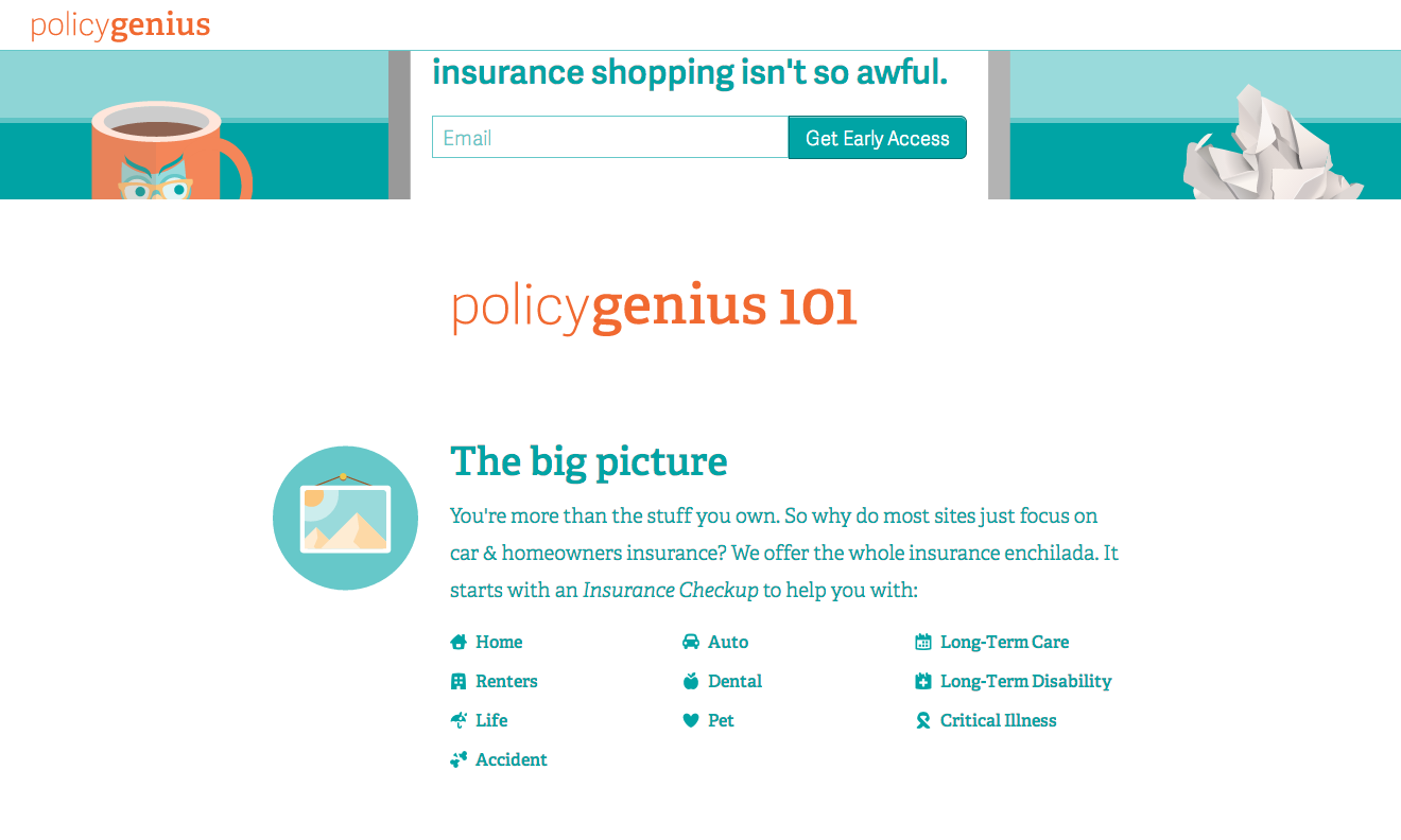
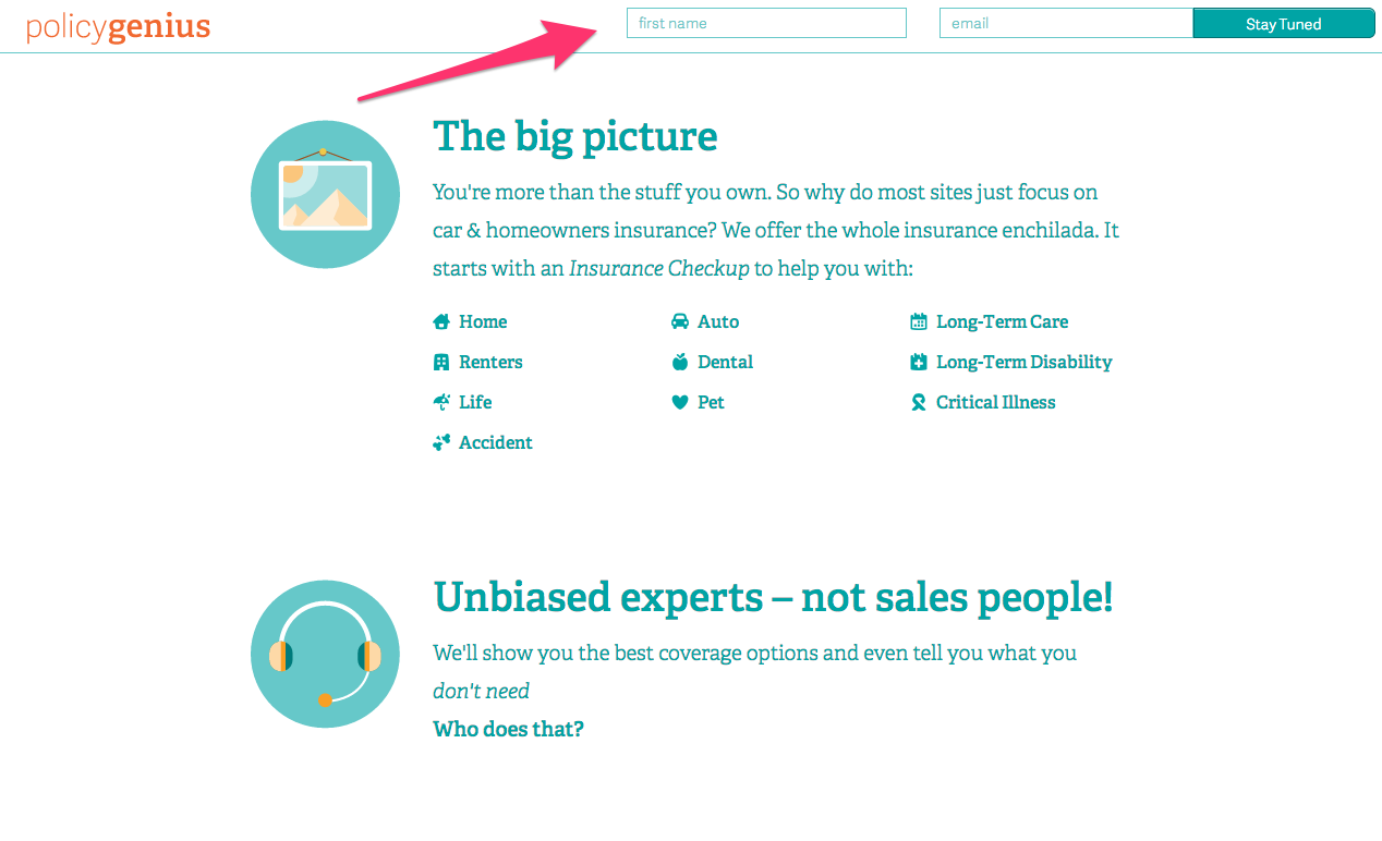
The responsive design of the site allows users to scroll and discover more information about the service without straying too far from the signup box. Scroll slightly and the box shrinks slightly, scroll away completely and a small signup header appears at the top of the page. Not only does this improve the chances of converting visitors into subscribers, it also makes navigating the site easier for the visitor.
The design embraces the scrolling trend of 2014
Speaking of making navigation easy, the site boasts one of the major site design trends of 2014 — lots of scrollability. By implementing scrolling, visitors are not only encouraged to stay on the landing page longer, they are also encouraged to explore the features of the service without fear of getting lost in the site itself.
Looking for more landing page design tips? Checkout our Landing Pages 101 whitepaper.