You know tax season has arrived when the ads begin to roll in through channels of all shapes and sizes: the H&R Block TV commercials, the retargeted display ads for CompleteTax and…pleasantly enough, a well-crafted TurboTax email right in the inbox. Let’s break down the tactics TurboTax uses to draw subscribers through the SaaS funnel.
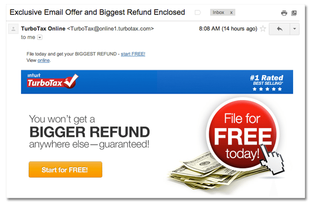
I opened the email because hey, I’ll admit it: I haven’t done my taxes yet. And that subject line, “Exclusive Email Offer and Biggest Refund Enclosed” sounded pretty promising.
Good use of header text
While many email marketing materials neglect the header (which fills any empty space behind the subject line in subscribers’ inbox), Turbo Tax makes good use of the space by inviting users to “File today and get your BIGGEST REFUND.”
Show benefits with visual hero
The visual hero in this email is a pile of cash with a button on top — two symbols that clearly illustrate the benefits of the software: start for free and get money back.
Convincing button text
We know about the importance of optimizing button text, which should invite users to take a next step but avoid intimidation. “Start” is less intimidating than “Sign up” or “Buy,” and the word “Free” always adds a bit of extra incentive.
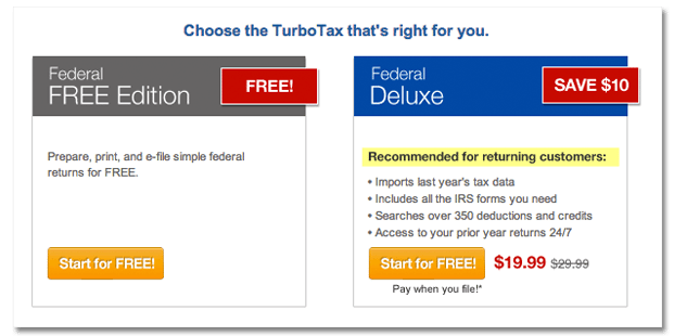
Weigh freemium and paid options
The email also notes the two versions of the software: free and paid, with a list of benefits of converting from freemium to paid.

Provide testimonials
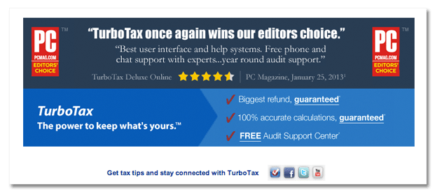
Last but not least, TurboTax provides third party proof of the product’s value: a press endorsement from PC Magazine. Press and customer reviews help to build trust between company and customer.

