Compiling a regularly scheduled email newsletter seems like a relatively simple task, but when you get down to the details there are dozens of finite questions to answer, from title to sharing options to which content makes the cut. Sprout Social’s brand new newsletter sailed through our inboxes last week and just so happens to work as a great example of all the small parts coming together to keep a brand and its quality content top of mind.
1. Title
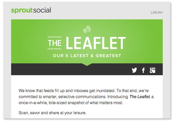
“The Leaflet” is an example of clever newsletter names that incorporate the brand name in a not-so-obvious way. There is also a subhead that explains what the newsletter is in five simple words: “Our 5 latest & greatest.”
2. Introduction
This being the first issue of The Leaflet, Sprout used a short paragraph to clarify the what, why, when and how of this “smarter, selective communication.”
3. Mixture of content
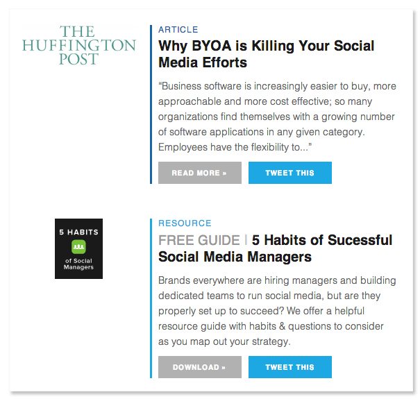
Sprout limits itself to five pieces of content: a combination of guests posts in other publications (e.g., Sprout founder Justyn Howard’s recent piece in the Huffington Post) and downloadable resources produced by the Sprout team.
4. Clear calls to action
Each of these CTAs is built as a large rectangular button, which is nice in that it stands out via desktop and is easy to tap via mobile. You’ll notice “Tweet This” buttons not on the newsletter itself (because who tweets an entire newsletter?) but on the individual articles. If that’s not something you’re into, there is also an option to jump into the article or resource.
5. Closing
To close things off, Sprout invites readers to “stay connected for more articles, updates and resources” with links to Twitter, Facebook and Google Plus.  Which branded newsletters do you make a point to open each and every time? How come? Share your favorites with us below.


