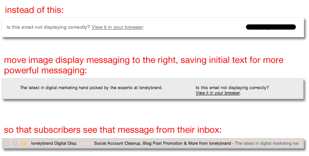
You know the importance of newsletter names, email subject lines and from fields (and hopefully test those on a regular basis), but you might be missing one more opportunity to convince subscribers to open your marketing emails.
Most email marketing programs automatically populate email headers with the message, “Is this email not displaying correctly? View it in your browser.” When there are images involved, it’s absolutely essential to provide this messaging so that users can download and view those images.
The Problem
At the same time, it’s important to note that the first line of text in your email header will follow the subject line in a subscriber’s inbox – making it one of the first things they see before opening the email. In other words, the initial header text becomes one of the determinants in whether or not your email actually gets opened.
Take a quick scroll through your inbox and you’ll notice that this header text is often neglected. Many marketers let the “Is this email not displaying correctly?” line slide through to that all-important inbox preview real estate, adding zero incentive for subscribers to actually open the email. We wrote more about writing effective email subject lines here.

The Solution
Try pushing the image display messaging to the righthand side of the header, leaving the initial text to a more valuable message that will entice users to open your email. This way, you still communicate the important image download messaging to subscribers, but it does not show up in a user’s main inbox.
It seems trivial, but with the minuscule amount of information you can communicate within an email preview, every character counts.
