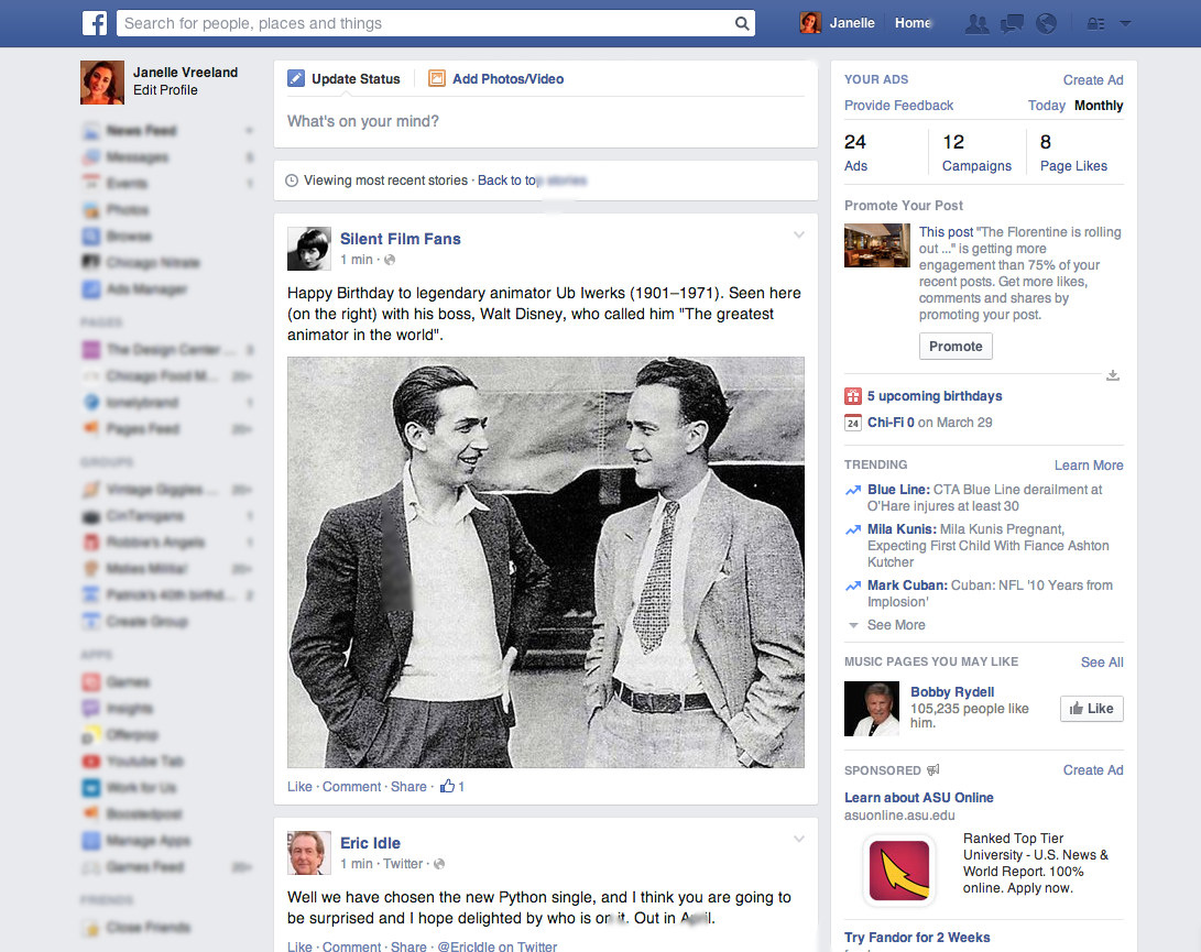
If you woke up over the weekend and discovered that your Facebook Newsfeed resembled something like this…
…you’re not alone. Although the Newsfeed itself is a bit disorienting at first, the bigger concern for brands is optimizing creative to fit this new layout. The good news? You can easily create imagery to fit this new layout. The bad news? You’ll have to give up your love for 1:1 images.
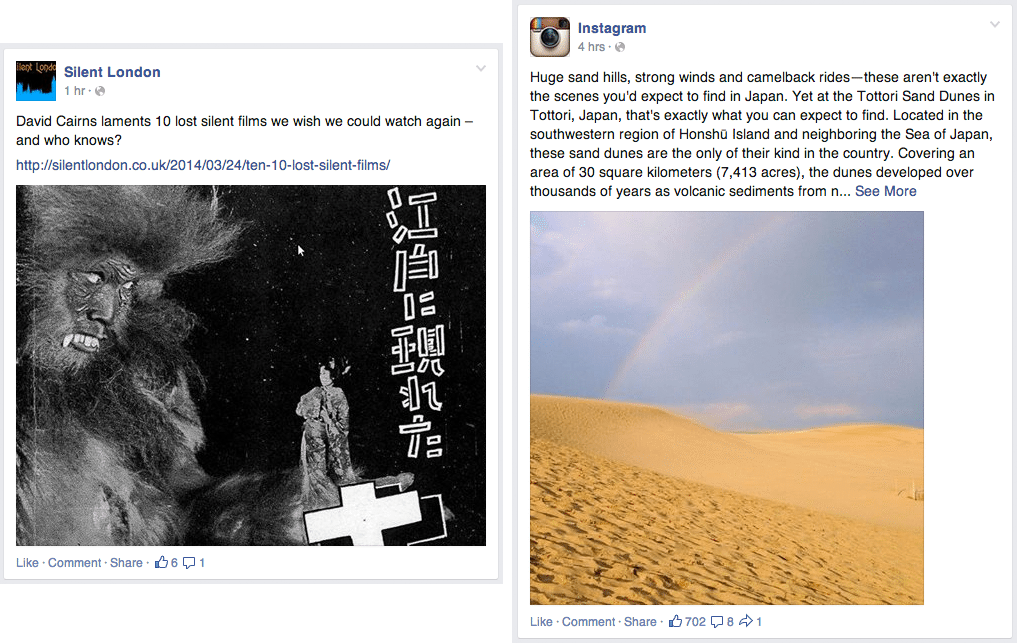
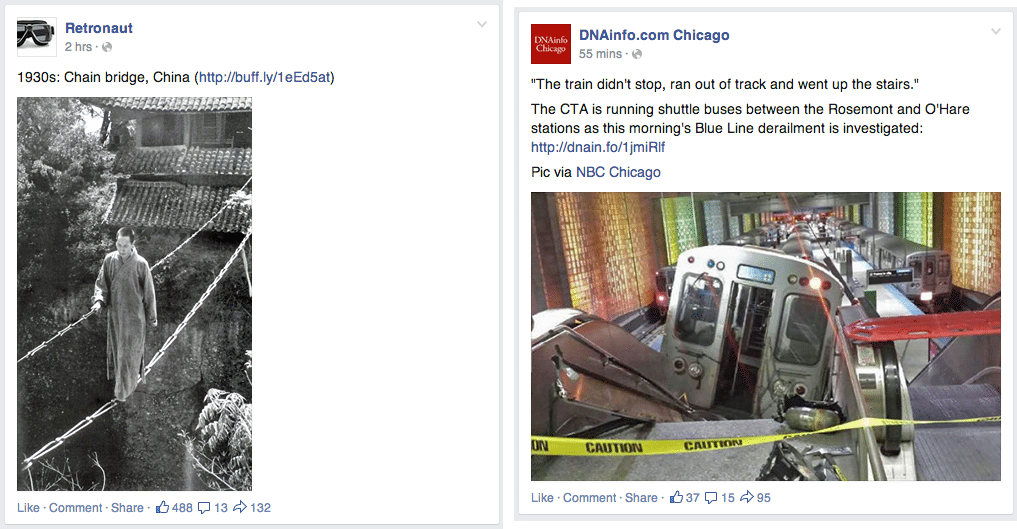
Simply put, if you want to optimize your images for Newsfeed’s new layout, you need to discard the old 1:1 rule. Square images are no longer ideal. See?
Instead, images adhering to a ratio of 235:197 are the ideal. They will scale down to the 470 x 394 px space perfectly. Images that don’t adhere to that ratio will be scaled down, not cropped. Portrait images will be scaled down to adhere to the 394 px height requirement, while landscape images will scale down to adhere to the 470 px width requirement. Here’s how images failing to meet that ratio requirement will appear in Newsfeed.
Link preview images have also been altered. Links with featured images that are 470 x 246 or larger will be shown like this:
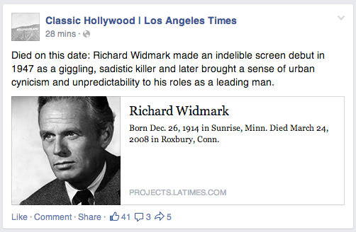
Links with featured images that are smaller than 470 x 246 will be reduced to 154 x 154 and appear like this:
Links with featured images that are smaller than 154 x 154 will either be reduced to 90 x 90 or will not appear at all.
Perhaps the most interesting part of the new Newsfeed is that Facebook acquisition Instagram’s square images are no longer optimized for this new layout.
Have you noticed any other design quirks with the new Facebook Newsfeed layout? Share them with us in the comments below. And if you need additional help with your Facebook marketing strategy, refer to our helpful how-to guides here.
