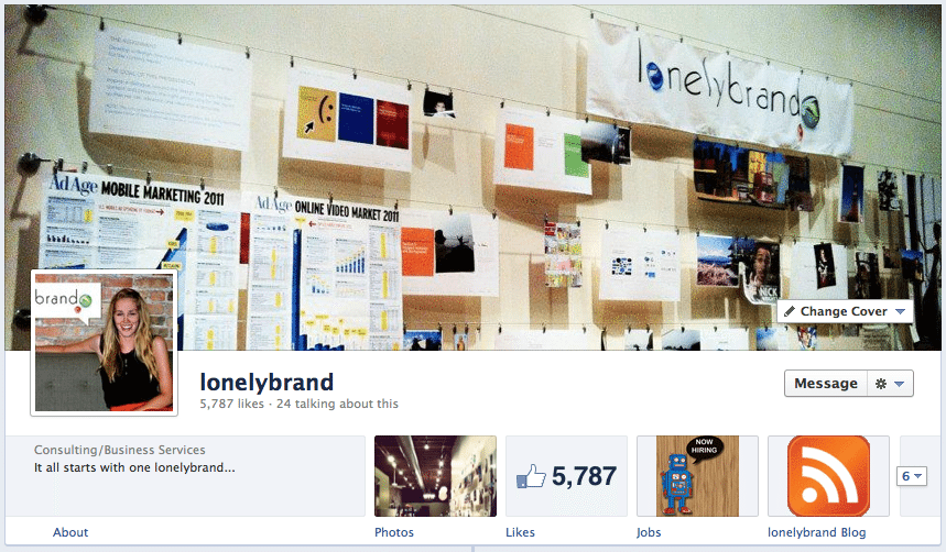
Facebook premiered its highly-anticipated Timeline for Pages on Wednesday, introducing a host of tweaks on both the front end and back end of Pages in what we think is a huge step forward for brands on the world’s most popular social platform.
We broke the updates down into 10 essential changes:
Timeline
Obvious change number one: Pages are now in timeline format and revolve completely around the story of your brand. If you don’t have a good story, you’ve got until March 31 to write one. Pictures, videos and Milestones can all personify your brand, so get to it.
Cover photo
Another format change that you’ll notice right off the bat is the introduction of cover photos. Instead of the small profile image in the upper left corner of your page, you get an 851 by 315 pixel banner right on top, plus a mini version of your profile picture that hangs out in the bottom left corner of your cover photo. It’s a canvas for creativity, minus a few semi-predictable restrictions from the powers that be at Facebook.
According to Facebook terms, you can’t encourage people to upload your cover image to their personal timeline (listen up, barackmytimeline.tumblr.com) or display a call to action like “Like Us” or “Download This.”
Image sizes
Apps icons, profiles pictures and general images within Timeline all show up in slightly different proportions. Just be aware and ready to make adjustments in case your photos look a little screwy. This is a good set of edits to take care of while you’re still in Timeline preview mode.
Apps

Before the big changes, Facebook apps resided in the lefthand column of the page. Now you’ll find them just under the cover photo on the righthand side. There are 4 tiles available, and the first is permanently set to photos. So now you’ve got the chance to show off 3 apps – anything from videos to events or personalized apps. We reserved these spots for our jobs page and our RSS feed app here. More apps are available under the collapsible arrow.
No more landing pages
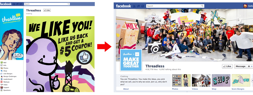
Hopefully you’re not too attached to your brand’s Facebook landing page, because this is one feature that did not carry over to Timeline Pages. While they lasted, landing pages were an opportunity to welcome visitors, promote a contest or explicitly say something along the lines of “dude, like us.” Some marketers are bound to be distraught about the loss, but Facebook life will surely go on without them.
Pin/Highlight functions
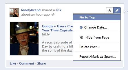 The old version of pages displayed everything in reverse chronological order with no opportunity to alter what users see first. Timeline offers the ability to pin posts to the top lefthand corner of your feed. So if there’s an article, event or photo you want your audience to see first, give it a pin. To pin a post, hover over the right hand corner, click the pencil icon and hit “Pin to Top.”
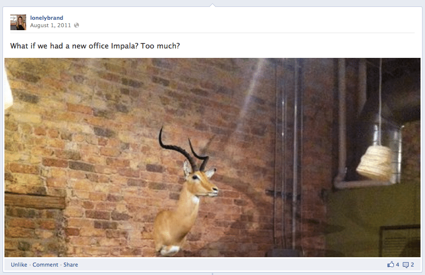
You can also highlight past posts that you want to stick out. As you can see in our office impala example below, highlighted posts appear larger than normal posts, so they’re bound to attract more attention. It’s a great function for a post with lots of likes or positive feedback. To highlight a post, hover over the righthand corner of the post and hit the star icon.
Milestones
With Milestones you can emphasize important events in your brand’s story. From the date you were founded to a big new hire or a move to a new office, this is a cool way to monumentalize the epic events along the way. Milestones appear with a flag and date, as seen below.
Social connections
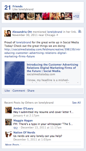 Timeline Pages are slightly more social than their predecessor. First we have the “Friends” box just below the apps. This shows how many of any users’ friends like the brand and, also plugs in 10 pictures so you actually see their faces. It’s that whole “if your friends are doing it, you probably should too” mentality.
There is also a box that shows what your friends have said about the brand – this will plug in any relevant likes, mentions or posts from your connections (if available).
Finally, we have the recent posts by others box to show what others have said on your brand’s wall. These aren’t necessarily comments from friends, but it’s a good way to display user interactions.
Admin panel
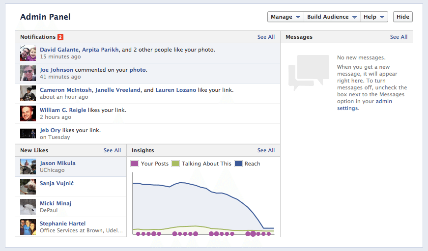
Over on the back end we see a few more changes, starting with the new and improved Admin Panel. If you’ve managed a Facebook page in the past, you know that getting to the edit page required one too many clicks. Now the Admin Panel conveniently hangs out on top of the page for any admin who visits. Here you’ll see notifications, new likes, messages (we’ll get to that next) and a brief look at Facebook Insights.
Messages
Brands can now send and receive messages from users. You’ll see this feed on the righthand side of the Admin Panel. This is a good avenue for handling customer complaints or exchanging contact information.
The changes may seem vast, but Facebook success ultimately still comes down to telling the story of your brand in a way that is interesting and inviting to users; Timeline is just a new narrative-friendly format.
Has your brand made the switch over to Timeline? Share your thoughts and tips with us over on Facebook.
