 During my freshmen year of college back in 2007, I had a friend who had taken a video with which we believed we could go viral and be the next big thing on the Internet. We were ready to put it on YouTube and let the millions of viewers flock to us when our particularly computer-savvy friend had a suggestion. “If you want something to blow up,” he told us, “you have to put it on Digg.”
So we put the video on Digg and we waited. While we only managed to get around ten Diggs, we saw our video accumulate several hundred views. The point stood: if you wanted Internet success, all roads led through Digg. These were Digg’s golden years, when Google was ready to offer the company $200 million dollars for its acquisition.
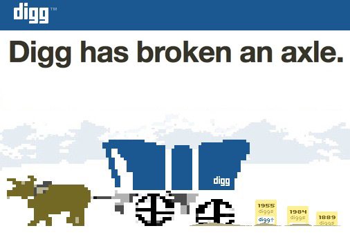
But oh how the mighty have fallen. In just a few years it lost its founder and most of its tech staff and was just recently sold for about $16 million (don’t be misled by those claims of $500,000). Many content aggregators only mention the former giant in jest.
So what happened to Digg, and what can brands learn from the fall of such a large entity?
Don’t Make Sacrifices Solely to Make a Buck

In its prime, Digg was filled with devoted users who would make frequent checks to the site to see if the list of most Dugg (highest voted) articles had changed. One of the major reasons for losing so many users at once was its implementation of promoted content, of which user votes had no effect. The novelty of Digg suffered, and a huge chunk of Digg’s users left immediately in what some jokingly called the Digg Exodus. The lesson here is that any changes you make to your product or service must also benefit your users, or you may see them looking elsewhere for services that better suit them.
Design is Important
While I don’t remember the original Digg site design to be anything particularly impressive, it had such a tried and true look and feel to it that when its new design was unveiled, users cried out and made accusations of Digg simply copying the layout of Google at the time, moving many buttons from the top of the site to its side. Digg came off as uninterested in its users’ opinions when it didn’t quickly respond to their complaints, further causing users to flock to greener pastures. Especially these days when your website is at risk of looking like its stuck in 1993, you need to be careful of how your site looks and be conscious of user feedback.
Even if You’re On Top, You’re Still in a Competition
Digg was an innovation and was at one point easily the most popular site of its kind. What Digg failed to realize was that when providing a service, especially one for free, there are always other options to explore. Even though it was massively popular and well-loved by its user base, Digg overestimated its importance to its users, and when it seemingly sold out, it caused its user base to investigate other social news sites and abandon ship.
The only company that can get away with routinely changing its design and functionality and angering its users is Facebook. If in fact you are not Facebook, avoid making widespread, sweeping changes to your website and offerings all at once. It’s no secret that web denizens are no fans of change, even if it is for the better. I suppose one could say make sure your users will Digg your execution. Oh snap.