
Often you get only one chance to have your brand make a strong visual impression, one that will keep your viewers engaged. That means that the design of your brand’s visual components needs to be spot on, not only in messaging but also in impact. And if you’re engaging in more modern tactics like brand ambassador marketing, keeping these ideas in mind is even more important.
Fear not, fellow marketer. We’ve created a list of branding ideas to inspire so you can work on what really matters: Execution.
The most successful brands aren’t just out there selling products, they’re creating a lifestyle around their brand, and they’re using certain visual techniques to do it. Most of these techniques are taken from the world of art and photography, but they still apply strongly to branding. Here are some of the most impactful.
Color Branding Ideas from the Majors
Color is one of the first things your viewers will notice. It’s also one of the first things that will create an emotional response, which in turn lead to a sale or a passing by. In fact, a study called “Impact of Color on Marketing” states that between 62‐90% of snap judgments about products are based on color alone. That’s a huge percentage! The results of their study also indicate that color can be used to “increase or decrease appetite, enhance mood, calm down customers, and, reduce the perception of waiting time.”
So practically speaking, the big question then remains: Which color to pick? Unfortunately, there’s no easy answer. It depends on what impression or personality you want to be associated with your brand. How a color affects viewers depends on context. So while it’s useful to understand what general traits go with which color, it’s best to choose according to the overall feeling you want the colors to evoke.
Let’s take a look at one of Nike’s landing pages:
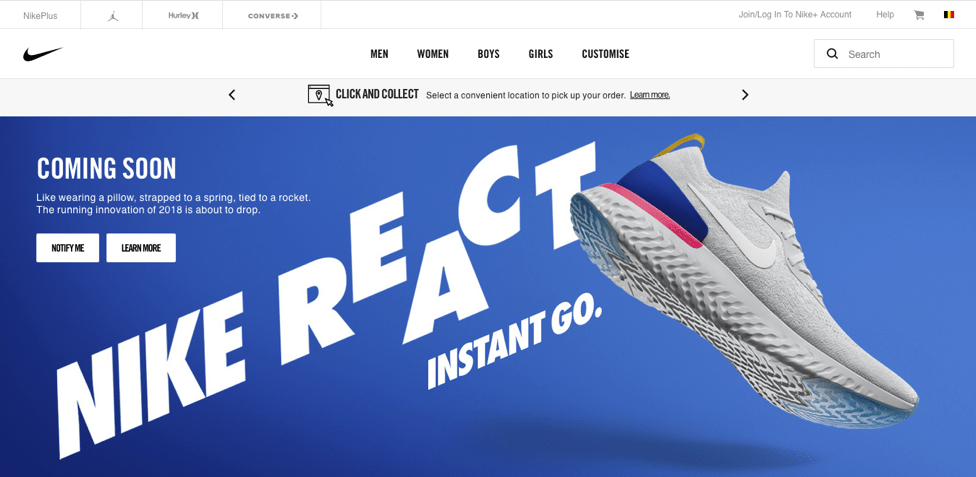
Their predominant color is blue—one that studies show is favored by both men and women (more so by men). Yet, while common color theory claims that blue signifies “calmness” and “tranquility,” in this context it’s clearly supporting Nike’s context of “action.”
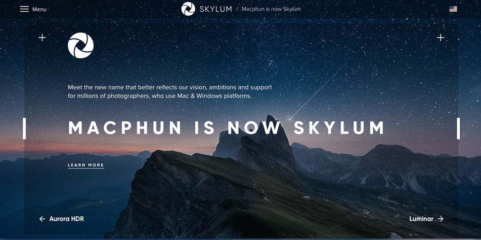
The darker tones and the image associated with them suggest depth and creativity, as well as a sense that “the sky’s the limit”—something useful for the lifestyle branding of a photo editing software company. Even if the color tones were lighter like in the Nike ad, the context would still give it a different feel.
Placed in a different context, like the landing page below for Skylum software, blue can create an entirely different feeling.
Starbucks, for example, uses warm and welcoming color palette which gives a comfy home-like feeling:
For more detailed information on how color affects branding, check out this post from Help Scout.
Using Negative Space for Branding Ideas that Stand Out
Negative space, the area around the elements in your image, has a greater impact than many people think. It not only ensures that the viewer’s focus lingers on the main elements and message, it also sets a mood and feeling. If you look at the Nike landing page above, the negative space gives a sensation of air and “spring-ability,” underlying Nike’s message of effective action.
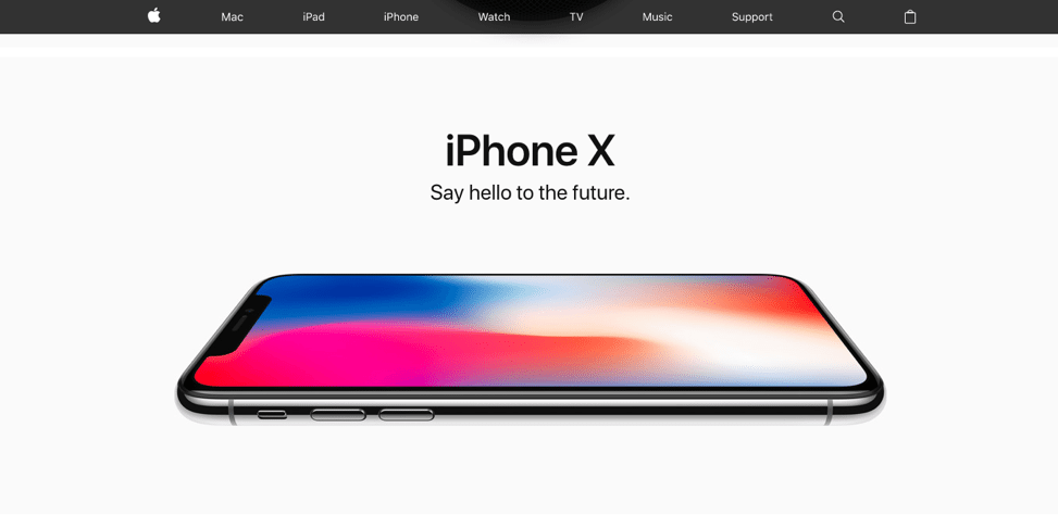
Apple’s landing page below also uses negative space, a lot of it. Here it serves to keep all of the focus on the phone and the (minimal) text. Yet beyond that, it magnifies the sense of sleekness and technological competence of the product. The added effect of putting the only color on the screen of the phone also creates impact, subconsciously suggesting that life and creativity lies in the phone itself. As a result, Apple’s use of negative space and color here work together to create a sense of “possibility” and effective, futuristic design, tying into their lifestyle message that this is the phone of the future.
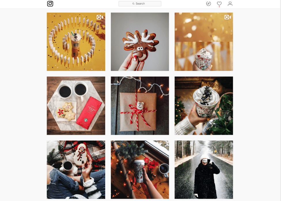
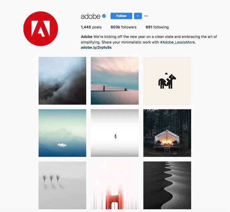
The negative space is also used widely on Adobe’s Instagram – in fact, it is solely dedicated to minimalist and simple art – “Less is More”:
Composition (The Rule of Thirds)
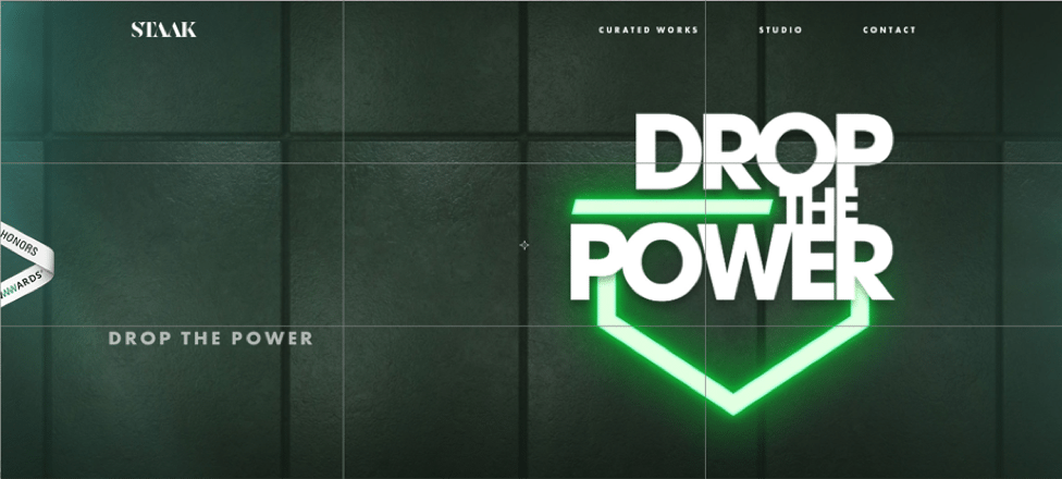
The rule of thirds is a design technique that divides an image into nine equal parts. Placing the key items on the intersection points generally creates a sense of balance and aesthetic pleasure for the viewer. It’s especially effective when combined with the judicious use of negative space. In the example below, UK design firm Staak uses a combination of the rule of thirds, negative space, and color to create a sense of boldness and electrified power.
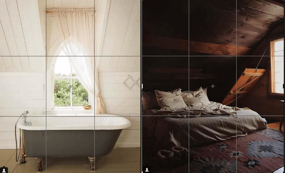
Composition rules could be used for Instagram photos itself. Check out some examples Airbnb’s Instagram:
The Power of Association: Taking Branding Ideas to the Next Level
The power of association is an age-old marketing technique that uses a human’s innate tendency to associate the one thing with another, even if there’s no actual relationship between the two. For example, beer companies often place photos of “smiling, happy people” drinking their brand of beer in their advertisements knowing that viewers will unconsciously begin to associate their brand with having a good time.
Some companies use this technique more than others. For example, Wells Fargo populates its website, bank branches, and even ATMs with imagery of “smiling, happy people.” Often times, the image won’t even have much to do with the topic—it just creates an emotional response that then gets associated with the Wells Fargo’s brand. In the image below, we unconsciously assume that the smiling chef on the left is happy because she’s a checking customer.

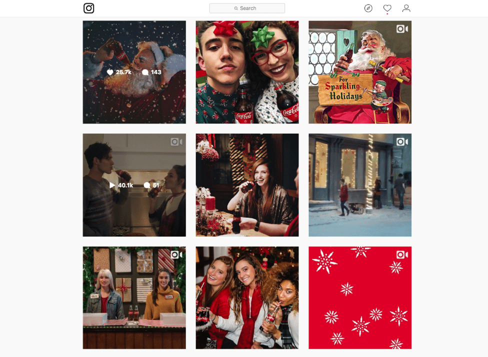
On Coca Cola’s landing page, the three happy celebrators (and especially the smiling woman on the left) suggest that Coca Cola’s a brand to celebrate with.
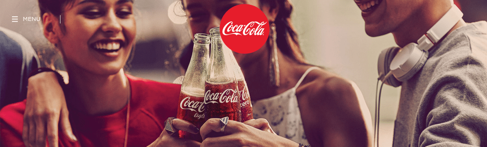
Same thing is on Coca-Cola’s Instagram:
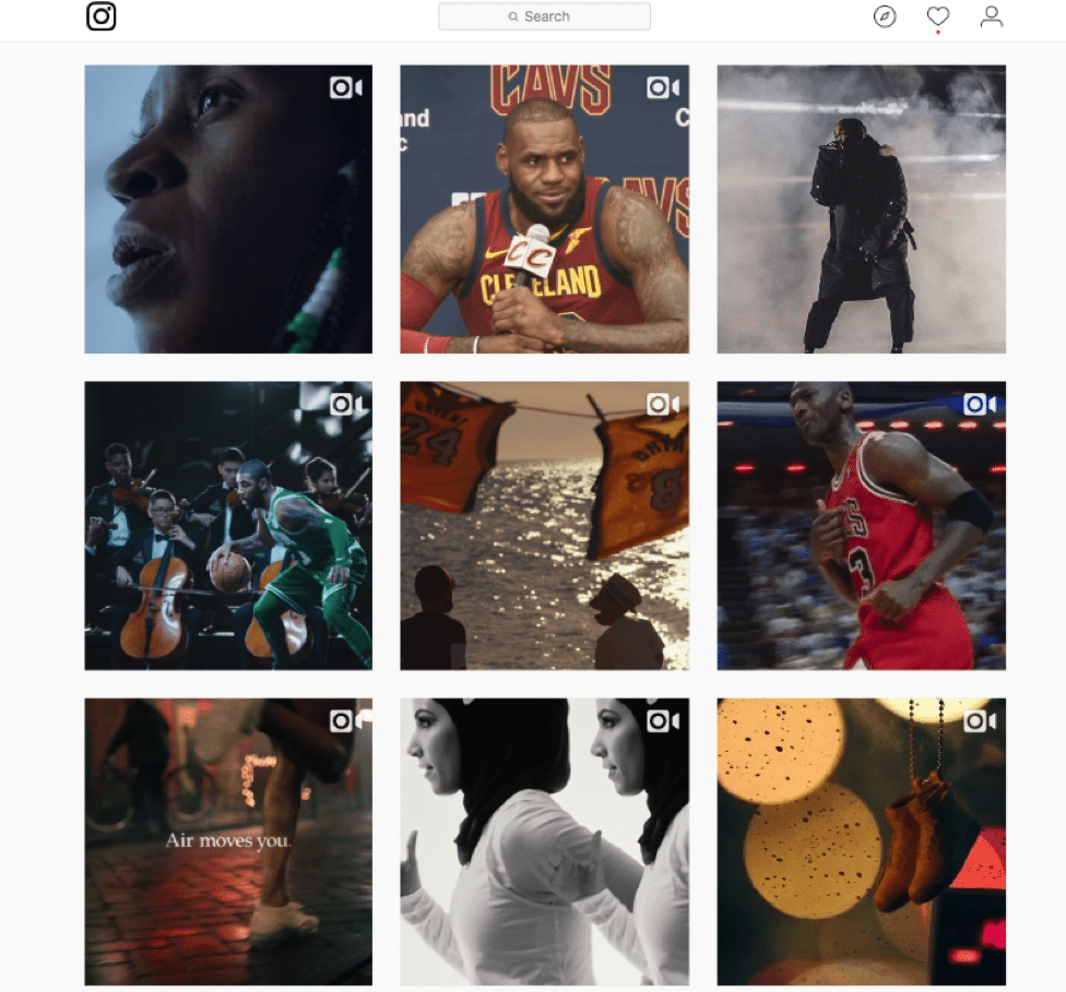
Still, while using these visual techniques can certainly boost your visual appeal, the key behind any successful marketing is to make sure that your visual message promotes a lifestyle that consumers can connect with. Let’s take a look at Nike’s Instagram. Today, Nike is the 2nd most followed account, with 75.8m followers. Company’s brand promotion is very subtle; they involve their audience by promoting a lifestyle and inspiring them. Their brand is just a part of the whole story told with one image:
Branding Ideas When You Aren’t In Full Control of the Message
It’s no secret that social media has changed marketing forever. Now influencers can create content about brands they love 24/7, potentially overriding your own branding ideas with their own. Companies that engage in brand ambassador marketing or content creators that want to become brand ambassadors take note. Providing these individuals with a branding ideas guide as part of initial discussions could help control the message and maintain a certain level of quality.
Whether it’s a life still of effective action, happy celebration, or creating visual masterpieces, have both strong visual design and a lifestyle message will keep your customers coming back for life.