Depending on how active you are on Google Plus — and how often you visit your own personal or brand page — you may or may not have noticed the revamped appearance of the network’s profile pages. The new look places a lot of emphasis on the visual elements of the page, and presents vital info in a cleaner, more organized way. Here’s a quick rundown of the major changes.

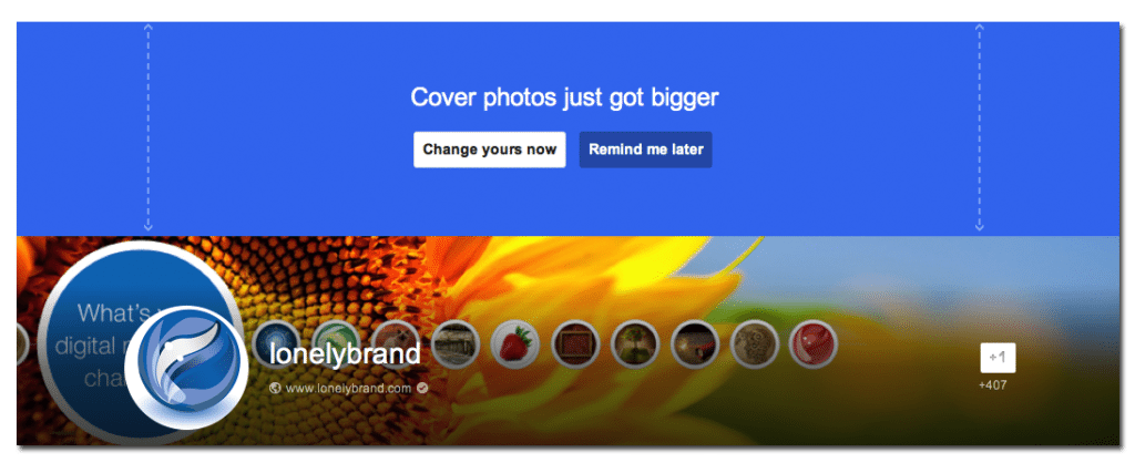
New, larger cover photos.
Although not wider, the Google Plus cover photo space has gotten taller, giving it more visual impact than it had previously. The dimensions of the new cover photo space is 2120 x 1192 and, if you want to avoid cropping, your photo should have a 16:9 aspect ratio.
Shading on cover photos to highlight information.
Essential info like brand name and site url now overlap the cover photo. To make it stand out, shading is automatically applied to the bottom of the photo. Although the shading helps, when choosing a new cover photo, make a conscious decision to choose a darker photo. The darker the photo, the easier it will be for followers to see your info.
A new shape, and location for profile pics.
Formerly located near the bottom right corner of the cover photo, profile pics are now located left of center, directly on top of the cover photo. And, instead of the go-to square shape, the new profile pics are automatically cropped to be circular. If your pic leaves something to be desired when cropped as a circle, it’s time to update it!
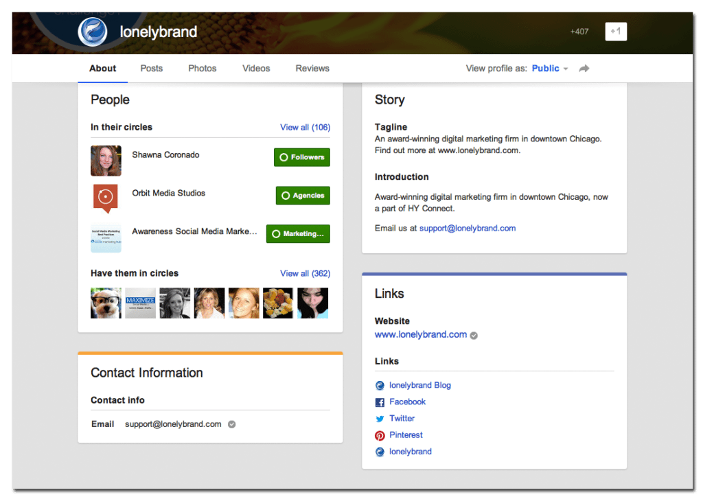
New organization layout for company info.
The About section has also gotten a makeover. Now featuring color-coded boxes for each area (People, Story, Contact Information, Links), the new layout is fresh and clean and makes it easier for viewers to quickly locate your information. Because it’s easier to find now, it’s a good time to make sure your company story and info are up to date.

Still aren’t sold on using Google Plus for business? Check out our detailed guides and find out why you should be.