Americans do a good deal of reading on mobile devices these days, so it’s no surprise that 75% of smartphone users prefer mobile-friendly sites. If your brand is looking to spruce up its mobile site experience, take some inspiration from these publications that optimize content for mobile by putting a strong emphasis on simplicity.
Pitchfork
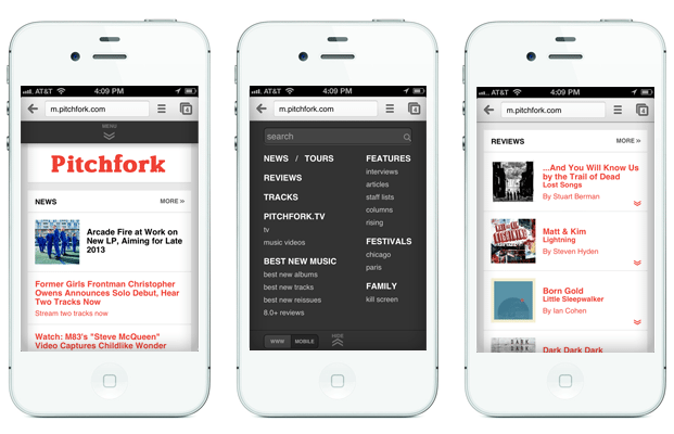
With over 2 million Twitter followers, chances are that Chicago-based music publication Pitchfork gets a good deal of its traffic from mobile devices. To ensure a good experience for these users, the mobile experience is clean and simple, splitting the homepage into five separate boxes: News, Reviews, Tracks, Pitchfork.TV and Features. A drag down menu offers other options that conveniently avoid the hard-to-tap constrains of a standard desktop header.

ReadWrite
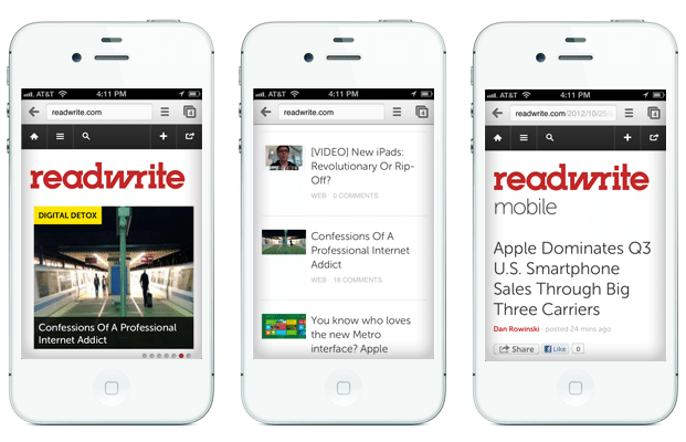
Sporting a new name, a new look and an new Editor in Chief, this publication has seen its share of changes in the past month. Their mobile site is certainly heavy on the white space – a feature I’m partial to on any device, especially the smaller screen. ReadWrite’s mobile homepage features a swipe-friendly slider that takes up the first full frame. Below are very basic article listings with thumbnail, title, category and number of comments.

Refinery 29
The mobile version of style site Refinery29 offers a slimmed down version of its desktop site. A standard menubar is included, but selections are limited to keep buttons large and tappable. Under the menu, a slider auto-scrolls through visual article previews. Remaining article listings are limited to category, image and title – author, comments, and social buttons are all removed, likely for simplicity’s sake.

Which features do you prefer for mobile sites?